This is a blog with spoiler free reviews. Most will be Fantasy, Science Fiction, and Horror, but there will be some books in other genres, including the occasional Non-Fiction review. There is an ongoing series of Cover Reveal Round-Ups, and sometimes I'll write an article on something that interests me.
Showing posts with label Terry Pratchett. Show all posts

01 May, 2014

COVER REVEAL ROUND-UP (XXIV)

   The Inheritance Trilogy from N.K. Jemisin gets an omnibus edition from Orbit. It will be out 9 December 2014. You can get more information, including the author talking about the included new novella here. I really liked the original covers for the three books (, and the books). But I really like this one too. It's more pared down than the originals, but it still evokes the feeling of the novels. Looking forward to seeing this in real life.


   From Delacorte Press comes the cover for the second book in The Reckoners, it has a publishing date of 6 January 2015. (This is the US edition.) I have not read the first book, Steelheart, so I can't speak to how the cover represents the book. But it looks kind of strange for an SFF book to me, more like a typical Action Thriller. It is eyecatching, and that is what a cover is supposed to do.


   Another sequel, this is the follow up to Robocalypse. This one will be out 10 June 2014 from Doubleday. I think this is a great cover. I've had it on my computer for a while, and it always draws the eye when I look at the folder of book covers. It's not just the green eyes, but they do accentuate the a face that is just a little bit too smooth.


   Following up, Ancillary Justice, and being the second book in the Imperial Radch, this book is out from Orbit 7 October 2014. The art is by John Harris, with design by Kirk Benshoff. As with the previous book, this is traditional Space Opera art. You can find examples of books all the way from the middle of the last century that have similar looking covers. I think that is its strength. I like those types of covers, so I think this is a very good cover.


   Art by Steven Meyer-Rassow is on this follow up to Skulk from Strange Chemistry. It will be released 2 September 2014 in North America and as an e-book, and 4 September 2014 in the UK. As with the first book's cover, I really like the symbol on this one. And I find the building very intriguing. This is absolutely a very good cover.


   This, the fifth Laundry Files novel, will be out from Orbit 3 July 2014. The design is by Crush Creative. This book at first looks cluttered, but a closer look reveals some heavy symbolism in the "blob". I've said before that I like symbols, and this is not an exception. Interesting and intriguing.


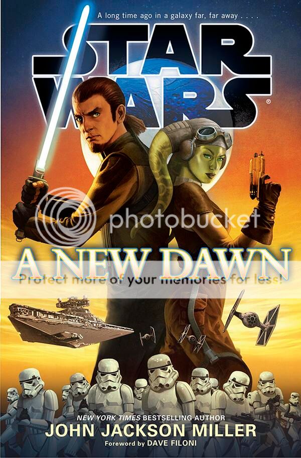
   Then we move on to a trilogy of new Star Wars covers on books coming from Del Rey Books.


   The top one is pretty awesome for Original Trilogy fans like me, in that it has Darth Vader and the Emperor on it. You can read more about that one on the author's website.
   The second on is a pretty generic Luke Skywalker in Hero Pose image that anyone who read the comics in the 1980s will be familiar with.
   At the bottom we also have a pretty standard Star Wars image. The interesting thing is of course that it has two new characters on it.
   I am a fan of Star Wars, and I really like all three of these covers. 


   Coming 7 August 2014, with covers by Joe McLaren, the release of these two will complete Gollancz's Collector's Library editions of Discworld books. When I wrote about these releases initially, I said I liked them, and that still holds true. I just need to get hold of £199.80 to get these books.

13 March, 2014

COVER REVEAL ROUND-UP (XIX)

   It's been a few months since I last did this. (You can see part of the reason for that here.) I haven't kept a very close look on covers since then, so I have definitely missed some. But these are some of those that caught my eyes.

   I assume that those that read this has caught the news that there will be a new Fitz & Fool novel from Robin Hobb in August 2014. This is the cover for the US edition, coming from Del Rey. The art is by Alejandro Colucci. I'm hardly objective when it comes to a new Realm of the Elderlings book from Hobb, but I really like this cover. (You can read the first excerpt from the book here.)


   This is the third book from Kim Curran. I was pretty excited about the ending of the last one so I am of course very excited by this one. The cover is by Larry Rostant. and the book will be out in August 2014 from Strange Chemistry. As always, Rostant has made a great cover. I really look forward to getting my hands on this one.


  The third book in The Long Earth series will be out from Doubleday on 19 June 2014. I like this cover quite a bit. It does fall into the (sometimes overused) realistic Mars expedition image, but it is a good one.

NOTE: What is it with all the Mars books coming out recently, and in the not to distant future?


   The second Stephen King novel of the year has gotten a cover. This one will be out in November this year, and I assume this is the US cover. (More info here.) Not much to say about this one. It's got King's name on it, the title, and some lightning. Only the first one of those will be necessary for most book-buyers, so this will do the job. -I am looking forward to reading this though.


   Strange Chemistry has some great covers. I'll include this one with art by Sarah J. Coleman in that statement. I really like the style of this one, it's an image that makes me want to read the book. And since I already have an e-ARC I will try to do that before its release on 6 May.


   This is the cover by Alejandro Colucci for an Angry Robot Books release on 1 July 2014. This is a really great piece of art. I would gladly pick this up without knowing anything else about it than having seen this cover.


   This is the cover for the first book in a new series, it will be out 17 March 2015 from Orbit. Photo by Shirley Green, illustration by Don Sipley, and design by Lauren Panepinto. It's no secret that I like Gail Carriger's books, and that would make me excited for this one no matter what was on the cover. But I like the covers for Carriger's books, and this fits neatly into the style of those that have gone before. -A bit more info on the author's website.


   This is the third book in the second trilogy from Deas. It will be out from Gollancz 19 June 2014. I like dragons, and these are good looking ones. Looking forward to this one.


   This is the third book in this series, it will be out in January 2015 from Solaris Books. The cover art is by Jake Murray. I think the covers for these books just get better and better. And this image really makes me want to read this book.


   And Finally, the US cover for the latest Discworld novel. Out from Doubleday 18 March 2014. (It's weird that Pratchett has delayed release in the US. Maybe it's a contract issue?) Every time I see a US Pratchett cover I have to wonder why they don't just reuse the UK ones. They're not all bad, this one is actually quite good, but the comparison to the UK ones will always let them down.

18 December, 2013

REVIEW: RAISING STEAM


Cover art: Paul Kidby
Cover design and image manipulation: Claire Ward

RAISING STEAM
DISCWORLD BOOK 40
MOIST VON LIPWIG BOOK 3
BY
TERRY PRATCHETT

ISBN: 978-0-857-52227-6
Pages: 374
Publisher: Doubleday (Transworld Publishers)
Published: 7 November 2013

On the cover:

To the consternation of the patrician, Lord Vetinari, a new invention has arrived in Ankh-Morpork – a great clanging monster of a machine that harnesses the power of all of the elements: earth, air, fire and water. This being Ankh-Morpork, it's soon drawing astonished crowds, some of whom caught the zeitgeist early and arrive armed with notepads and very sensible rainwear.

Moist von Lipwig is not a man who enjoys hard work. As master of the Post Office, the Mint and the Royal Bank his input is, of course, vital... but largely dependent on words, which are fortunately not very heavy and don't always need greasing. However, he does enjoy being alive, which makes a new job offer from Vetinari hard to refuse.

Steam is rising over Discworld, driven by Mister Simnel, the man wi' t'flat cap and sliding rule who has an interesting arrangement with the sine and cosine. Moist will have to grapple with gallons of grease, goblins, a fat controller with a history of throwing employees down the stairs and some very angry dwarfs if he's going to stop it all going off the rails...


   Discworld has in many ways become the gateway to SFF for many people in the last 30 years, but it has changed quite a bit over the years. It has moved a long way from the parody of the first two books, but you can still see the seeds that lead to this fortieth volume in those books.
   As usual this is a standalone, but I would say that it makes much more sense as the third of the, series-within-a-series, Moist von Lipwig books. And I would advice anyone who isn't planning to read this only because they love (steam) trains to start at the first of those books, Going Postal.
   There's so many elements here, like Commander Vimes and Lord Vetinari, that come with all the baggage from earlier books, that actually reading this on its own would lessen the readers experience to a significant extent in my opinion. And that is also something I see as a problem for the later Discworld books in general, it has become much more of a series than it was. In fact it seems to be almost taken over by Commander Vimes, a character whose story really should have ended with 2002's Night Watch, and he crops up again in a much too big role here.
   Well, that is a bit of context, on to the review of this novel:

   It's obvious that this story is about steam power, or the railway...Except that is only one of three story threads here. There is one about how the goblins, golems, and other such creatures fit into life on the Discworld now that they have gotten recognition. That one is pretty slight here, and is something that has being going on in Discworld books for a long time.  We get a bit more of it here, and it works well as an update into an ongoing concern. But as I wrote about in the previous paragraph, this is another of the elements that has a lot of previous history to it. Although to be fair, this one works pretty well without familiarity with previous Discworld books.
   The second storyline concerns the dwarfs, specifically the conflicts between the orthodox members of the species and those that are open to change. This ties in very much with the railway, that stands as a symbol for progress. And they sort of fit together nicely. I say sort of, there's a problem with the dwarf part being its own thing. For that part of the story the railway is incidental, and it could have been anything. In fact, as it turns out in the end, it's something a bit more important than technical progress that is at the heart of the dwarf side of things. And I feel that this whole side of the story could have been better served by giving it a whole book of its own. Preferably one that wasn't hampered by having a previous leading character at the centre. I just think this story thread has more importance than being relegated to being one of two plot threads gives it.

   That being said, this is actually a really good story. Pacing-wise it is a really fast one, at times reminiscent of an Action Thriller. There is a lot happening, the book is really bursting at the seams with story. (Which can be a problem, as I have already mentioned.) Pratchett has put in quite a bit of good action scenes here, and there s some suspense involved. Although to be fair, it's mostly suspense as to how things are going to happen instead of what is going to happen. It does really pull you along towards the end though. I read to the end through the night, and finished in the morning, I didn't really want to put this down before I'd turned the last page.
   There is a nice build to this story. It starts out rather slow, introducing the railway and the players behind it. Once it gets going though there's a crescendo like building in the events surrounding this new technology. This is done extremely well, and it puts up a very good mirror to our world in that regard. Almost everyone reading the novel can remember events from their lifetime that happened in similar ways that the railways introduction to the Discworld. And as Pratchett has shown us many times before, he is very good at putting things in our world in perspective by using the Discworld.
   Of course that isn't completely problem free. New inventions cropping up has became a sort of Discworld cliche. We saw it in Moving Pictures and Soul Music, and this is the third such outing for Moist van Lipwig. And to be perfectly frank it is starting to feel a bit stale. Mind you, it is still very well done.

   On to the characters, the central one is Moist von Lipwig, a former con man who has become the man who fronts Ankh-Morpork’s forays into modernisation. I’ve liked him as a character before, and I still do to some extent, but he’s getting a bit stale. However, the problem here is that he isn’t really needed. You see, the characters of Dick Simnel, Harry King, and Lord Vetinari's secretary Drumknott actually fill all the needs of the story. They are certainly interesting people, but we only get a glimpse of that, because we have Moist von Lipwig running around doing stuff. Granted, he's a good person to go around giving the reader a glimpse of what's happening. But he's in some ways just fulfilling the role Rincewind had in the earlier books here by running around to show the reader things.
   I already mentioned the problems I had with Commander Vimes showing up. And there is some sense here that he does so only because of his popularity, the same can be said for Lord Vetinari. But they do fulfill their roles when they show up, and so does the rest of the cast. There's just no real new character development here. Dick Simnel, who is very central, doesn't really get to be much more than a stereotypical mechanical inventor/tinkerer.
   All of these characters are actually good, they just lack the depth we have gotten from Pratchett's characters before. They are really more like scenery to the story here, so well drawn and complex characters aren't really this books strength. With something of an exception for the Low King of the dwarf. But as the storyline of the dwarfs get a bit of a short shift here, so does their king. Hopefully we'll see more of the king's story at a later date.

   As a summation, I'll say that this is very much what you'd come to expect from recent Discworld books. The laughs are mostly gone, but there's plenty of smiles. The story is good, and it talks about important issues and shows us our world in a new light. For those who have read Pratchett all along there is a certain disappointment about the lack of something new though. It's a bit stale, and at the same time it feels a bit like there's a rush to get to the "end point" of the Discworld's development before it's too late.


   This is still a very good read though, and one I have no hesitation with recommending. Read it as a Steampunk-inventor novel building to a fast paced Action Thriller towards the end, and I think you will pretty much follow along with what the story is, in my opinion. The social commentary, and the mirroring of our world is still very well done, and is worth picking this up for if you like those kind of elements on your SFF.
   All in all this is good Fantasy, that just lacks that little bit to make the grade into great.

REVIEWS: I Shall Wear Midnight  The Long Earth

LINKS: Terry Pratchett  Transworld Books

15 October, 2013

COVER REVEAL ROUND-UP (XV)

   This debut novel will be out 13 February 2014 from Headline. The art is by Patrick Insole. I love this cover, I think it is absolutely great. It's a cover that sticks to the tried and tested (-there is a dragon-) but still manages to be different. -Really looking forward to getting my hands on this one!


   This cover by Amazing 15 is for the sequel to Emilie & the Hollow World (review). It will be out 4 March 2014 from Strange Chemistry. I liked the cover to the first book, and this is a perfect companion to that. I like this cover style in general, and having read the first book, I know it fits very well with the inside of the book.


   Coming in February 2014 from Gollancz. This cover has art by Andreas Preis, and is designed by Craig Fraser. This cover drew my eye the first time I saw it, it's different enough to stand out. I like it, and the style it is done in. -The title also looks very interesting.


   Art by Alejandro Colucci, out 25 March 2014 from Angry Robot books. This is the sequel to the soon to be released Heartwood. I really liked the first cover, and I really like this one. -Looking forward to soon be reading the first book.


   You may remember this title from an earlier cover reveal post. This cover is for the PS Publishing edition, and it's by Pedro Marques. It's a very good cover, and it does make you look at it more than twice.


   So over to five covers from Gollancz, for their re-issue - in Hardcover - of Terry Pratchett's Discworld books. The covers are all by Joe McLaren. You can get the release dates, and see more of the covers, here.
I like these covers. They may have a simple style, but they are very good at capturing the books they represent.


03 September, 2013

COVER REVEAL ROUND-UP (XI)

   This is the cover to the second book in The Stormlight Archive. I liked the first book well enough that I will be getting this. The cover is technically very good. However, unless there's a serious shift in the story, 18th Century pirates/Revolutionary War soldiers are not going to be in this. So someone who is clearly one of those two should not be on this cover. If I had been in any way uncertain about buying this book, this cover would have made it a definitive no. It just doesn't look like an Epic Fantasy book I'd want to read. -You can read about how the cover was made here.


   This is a completely different cover than the one above. This one is done by Will Staehle for a January 28th 2014 release from Angry Robot books. This certainly catches my eye, but I am not sure if I like it or not. I actually think I'll have to see this "in the flesh" to decide. -Sketches for other versions of this cover can be found here.


   An upcoming collection of stories dedicated to David Gemmel has gotten a cover by Dominic Harman. It will be out 31 October, and you can find full table of contents here. I must say I really like this cover. It's simple and forceful, and fits the subject matter perfectly. Couldn't really think of any way this could have been better.


   The cover for the new Discworld novel, the third featuring Moist von Lipwig. The book is coming from Doubleday 24 October, and the cover is by Paul Kidby. Not much to say here really, I love Discworld, and I love the covers. Really looking forward to this one.


   I just reviewed the previous book in this series yesterday. (I actually found this cover when looking for the previous cover for my review.) I don't think I'm going out on a limb if I say this too is by Steward Noack/Don Sipley with design by Lauren Panepinto. It will be out 12 November from Orbit. I think the cover really fits with both the previous ones and the series as a whole, and I have a thing for redheads...so, great cover!


   Art by Andy Bigwood, release from Newcon Press Easter(Con) 2014. This one is really stylised, and has a colour that makes it pop out from a mile away. I really like this cover, sometimes simple is simply better.


   This is the cover, by Jason Chan, for the first book in a new series called The Book of the Black Earth, it will be released in March 2014 by Pyr. This cover makes me want to check it out. And that's really a cover's job, isn't it.


   Finally, there's three covers for paperback re-releases. At least one of these should be out already. I like the subtle difference from the original covers on these. I have only got as far as book one on this series (, and I liked that enough that I really want to read the next two now that I write this), but these covers are do suit the books better than the original ones in my opinion.


   As usual I welcome any thoughts you have on these. And I especially would like to hear if anyone has the same feeling as me on the cover for Words of Radiance.

13 February, 2013

REVIEW: THE LONG EARTH

Cover photographs by Getty Images
Cover design by R. Shailer/TW

THE LONG EARTH
BY
TERRY PRATCHETT
&
STEPHEN BAXTER

ISBN: 978-0-857-52010-4
Pages: 344
Publisher: Doubleday
Published: 21 June 2012

On the cover:

1916: the Western Front. Private Percy Blakeney wakes up. He is lying on fresh spring grass. He can hear birdsong, and the wind in the leaves in the trees. Where have the mud, blood and blasted landscape of No Man's Land gone?

2015: Madison, Wisconsin. Cop Monica Jansson is exploring the burned-out home of a reclusive - some said mad, others dangerous - scientist when she finds a curious gadget - a box containing some wiring, a three-way switch and a...potato. It is the prototype of an invention that will change the way Mankind views his world for ever.

And that's an understatement if ever there was one...

   Parallel Earths isn't a new concept in Science Fiction, but the way it is handled here brings a new angle on it. The concept here is a great one, and it is something that can really be explored in a myriad ways. Unfortunately the way it is explored here leaves a lot to desire.
   The book starts out really slow, jumping back and forth in time, and doesn't really move forward for a very long time. There's too many threads at the beginning of the book, at times it felt like reading a collection of story ideas or a short story collection set in the same world. These different threads do add some flavour to the world the story is set in, but they do feel repetitive and they don't really add much to the novel overall.
   For me it was also frustrating that these different stories brake up the flow of the narrative. There is simply too many "false starts", making the book feel choppy and jumbled. Considering the relatively short length of the novel they felt more like padding added for length than anything else.

    Far from everything is wrong with this novel. I've already mentioned the great concept, and there are some interesting characters too. Perhaps the most interesting character isn't actually human at all, but an AI. It's kind of a bold move to have the main character play against an AI for large parts of the book, but it works very well.
   There are two interesting secondary characters too. One of them is introduced at the beginning, and the other we  meet much later in the story. Both of these seem well rounded, and they do serve to get the reader much nearer the main character. Apart from that one of them has quite an interesting story of her own that we get to follow.

   Where the novel excels, is in the worldbuilding/concept. The central idea of an endless number of parallel Earths is absolutely excellent, and what we learn about how that works is fascinating. It quickly becomes obvious that this is a setting in which anything can happen, and as such it's impossible to see where the story is going.
   And since I'm back to the story, I must mentioned that the ending was a bit of a letdown. Not because it isn't very interesting, because it is, but the cliffhanger ending comes as a disappointment when so much time has been "wasted" earlier in the novel. You are left with the feeling that you have read only half a novel, and that the story is really just beginning, by the time you turn the last page.

   Despite it's many flaws this is a novel that is worth reading. It presents a great setting, and just that would make it a worthy read. The story is really good to, when the authors allow it to move forward. As always, it is also very interesting to see Pratchett try his hand on a non-Discworld setting. And as this book has set up everything in detail, I have great hopes for the next volume, and will eagerly be awaiting it.

Review: I Shall Wear Midnight

Links: Terry Pratchett  Stephen Baxter  Transworld Books

08 November, 2010

REVIEW: I SHALL WEAR MIDNIGHT

Cover illustration: Paul Kidby

I SHALL WEAR MIDNIGHT
TIFFANY ACHING BOOK 4
DISCWORLD 38/
YOUNG DISCWORLD 5
BY
TERRY PRATCHETT

ISBN: 978-0-385-61107-7
Pages: 348
Publisher: Doubleday/Random House Children's Books
Publishing date: 2 September 2010


On the cover:

Tiffany Aching is a witch. And she thinks she's doing a good job for the people of the Chalk. Even if the job does seem to involve a lot of bandaging legs and cutting old ladies' toenails and not much, well, magic.

Or sleep.

But somewhere - some time - there's a tangled ball of evil and spite, of hatred and malice, that has woken up. And it's waking up all the old stories too - stories about evil old witches.

Suddenly Tiffany isn't sure she's doing the right thing. And her tiny allies - the fightin' Nac Mac Feegles - are only making things more difficult.

Things are supposed to look better after a good night's sleep.

But they won't.

They are about to get a lot, lot worse.

And a witch has to deal with what is in front of her...

   This, being a "Young Discworld" novel, features a teenage main character, Tiffany is 16 in this book. Other than that there is not much that is different from the other Discworld books. Pratchett writes in the same style as he has always done. And anyone who avoids this book because it is labeled as Young Adult (,the publisher's website says 12+,) does themselves a huge disservice.

    In my opinion this is perhaps the most serious Discworld book in recent years. It still has the trademark Pratchett humor, but the themes are very serious. Then again it would be difficult to make fun of growing up, responsibility,and bullying. And these are some of the main themes in this book.
    All is told through the eyes of Tiffany Aching, who is a witch, and this gives Pratchett plenty to play with. We get the some important lessons about the misconceptions about witches from fairytailes, and we also learn a lot about what a Discworld witch's real responsibilities are.

    It's easiest to see that this is a Young Adult novel by the many life-lessons that Pratchett manages to weave into the tale. There really is a lot here that an intelligent teenager can take away. And of course any teenager reading Pratchett will be intelligent. But I didn't feel that Pratchett ever got preachy, he presents things and lets the reader decide for themselves.

    The story also has room for an overarching plot that is quite sinister. In fact it is part horror story. This is very well handled, and does not feel forced upon all the other things that happen in the book.
  
    In my opinion this book shows that Pratchett is still going strong. Any Discworld fan who doesn't already own this should go buy it at once. -But I must say it helps if you have read the "Witches"-books and the previous three books about Tiffany Aching. At the least you should read "Equal Rites" before embarking upon this book.

Links: Terry Pratchett  Random House Children's Books